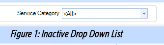
A drop-down list provides a items that drop down when the user clicks on the small down-arrow at the top of the list. The figure below is an example of a drop-down list for choosing a service category.
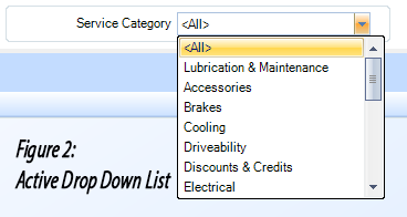
Usually, there is a label adjacent to the drop-down list that indicates its purpose. In our example here, the list contains a number of service categories. In the figure above, the default is <All>. Leaving this as the choice will result in selection of all items in the list. To choose a specific item from the list, the user would click on the down-arrow at the top, as shown in the figure below. Clicking on a particular item in the list will cause the list to disappear and that choice will appear in the box.
A button drop-down works is very similar to a drop-down list, though it is in the form of a button with a down-arrow. The figure below shows an Action drop-down button that has been clicked and now displays a small menu of the possible actions.
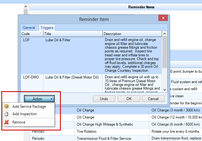
Figure 3: Button Drop Down Menu